ARTIST RESEARCH: |
|
|
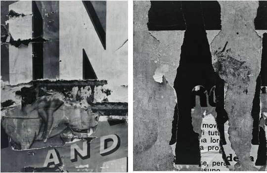
AARON SISKIND:
AARON SISKIND IS AN AMERICAN PHOTOGRAPHER WHO IS CONSIDERED TO BE PART OF THE ABSTRACT EXPRESSIONIST MOVEMENT. THE MAJORITY OF HIS WORK FOCUSES ON AND EMPHASISES TEXTURES. PERSONALLY I REALLY LIKE THIS FACTOR AS IN MY OPINION IT CAN BE PERCEIVED TO BE A FLAW. ALL OF HIS WORK IS IN GREYSCALE. THIS IS WORKS REALLY WELL AS IT EMPHASISES THE CONTRASTS WITHIN THE PHOTOGRAPHS. I INTEND ON USING MY RESEARCH WISELY IN ORDER TO PRODUCE A SUCCESSFUL INTERPRETATION OF HIS WORK. IN MY OWN INTERPRETATION I INTEND ON TAKING PHOTOGRAPHS OF DECAYING AND AGED OBJECTS; SIMILAR TO HIS WORK. I ALSO INTEND ON INCLUDING HIS FILTER STYLE OF MONOCHROME AS I THINK THIS IS DEIFINETLY A STRENGTH OF HIS WORK. |
|
GILLIAN WEARING:
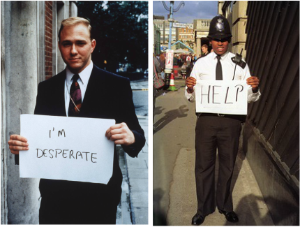
GILLIAN WEARING IS AN ENGLISH CONCEPTUAL ARTIST. PERSONALLY I
REALLY LIKE HER SERIES ENTITLED "SIGNS THAT SAY WHAT YOU WANT
THEM TO SAY AND NOT SIGNS THAT SAY WHAT SOMEONE ELSE WANTS YOU
TO SAY". THE SERIES INCLUDES A SERIES OF PHOTOGRAPHS USING A VARIETY
OF DIFFERENT MEMBERS OF THE PUBLIC, EXPRESSING THEMSELVES WITH
HAND MADE SIGNS. THERE'S A PARTICULAR PHOTOGRAPH WHICH I THINK
BRINGS ACROSS A STRONG MESSAGE. I HAVE INSERTED THE PHOTOGRAPH
ON THE FAR RIGHT. AS YOU CAN SEE THERE IS A POLICEMAN HOLDING UP
A SIGN THAT READS "HELP". THIS IS VERY CONTRASTING AS YOU WOULDN'T
EXPECT AN AUTHORITATIVE FIGURE TO BE EXPRESSING THEMSELVES OR
EXPOSING THEMSELVES IN SUCH A WAY. THIS IS VERY SIMILAR TO THE GENTLEMAN IN THE PHOTOGRAPH ON THE LEFT. IN MY OPINION THIS PHOTOGRAPH IS VERY CONTROVERSIAL AS AGAIN THERE IS A PERSON WHO IS EXPOSING THEMSELVES WITH NO FEAR OF JUDGEMENT. I THINK THE WHOLE SERIES IS VERY POWERFUL AND DEFINITELY REPRESENTS THE THEME OF FLAWS AND PERFECTION. THE PHOTOGRAPHS REPRESENTS FLAWS AS IT'S
BRINGING ATTENTION TO THE FLAWS WHICH ARE SEEN IN OUR SOCIETY AND ALSO THE FLAWS IN PEOPLE'S EVERYDAY LIVES. THE PHOTOGRAPHS ALSO IN MY OPINION REPRESENT PERFECTION AS I FIND IT ABSOLUTELY BEAUTIFUL HOW
PEOPLE ARE UNDERTAKING FREEDOM OF SPEECH, THEY'RE SAYING WHAT THEY
WANT TO SAY AND I THINK IT'S VERY SPECIAL THAT PEOPLE ARE DOING THIS.
|
STEPHEN GILL:
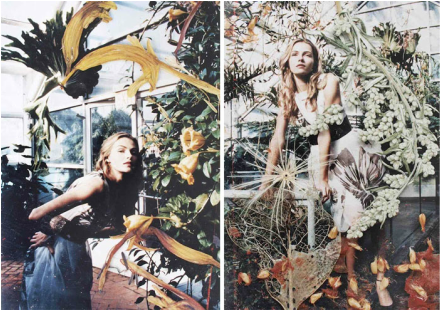
STEPHEN GILL IS AN ENGLISH EXPERIMENTAL PHOTOGRAPHER. HE IS KNOWN FOR HIS SERIES' ENTITLED 'HACKNEY FLOWERS' AND 'TALKING TO ANTS'. GILL CREATES HIS PHOTOGRAPHS USING SCANNED OBJECTS FROM THE LOCATIONS IN WHICH THE PHOTOGRAPHS HAD BEEN TAKEN IN. IN HIS SERIES ENTITLED 'TALKING TO ANTS' HE ADDS EMPHASIS TO THE OBJECTS WHICH WOULDN'T USUALLY BE NOTICED AND SCANS THEM OVER THE PHOTOGRAPHIC LOCATION. I THINK THIS TECHNIQUE WORKS REALLY WELL IN MY OPINION. I THINK IT'S A VERY UNUSUAL YET BRILLIANT IDEA - AS HE IS GENERALLY BRINGING THE PHOTOGRAPH OUT. I THINK THE FINAL COMPOSITIONS ARE ABSOLUTELY BEAUTIFUL. THE OBJECTS WHICH COULD POTENTIALLY BE SEEN AS A FLAW, HE TURNS INTO PERFECTION WITH A STUNNING COMPOSITION. I REALLY LIKE HOW HIS PHOTOGRAPH REPRESENT MY THEME OF FLAWS AND PERFECTION. I AM VERY EXCITED TO EXPLORE HIS STYLE OF WORKING. I AM INTRIGUED TO SEE WHAT I CAN ACHIEVE IN MY INTERPRETATION. |
|
|
LUCAS SIMOES:
LUCAS SIMOES IS A BRAZILLIAN ARTIST BASED IN SAO PALO. I REALLY LIKE HIS SERIES OF PHOTOGRAPHS ENTITLED AUSENCIA. HE ALSO HAS A VARIETY OF DIFFERENT SERIES WHICH HAVE THE SAME PRINCIPLE AND IMITATE THE MANUAL TECHNIQUE AND BURNING PROCESS. I THINK THIS TECHNIQUE IS SPECTACULAR, IT'S A REALLY NICE WAY OF REPRESENTING THE THEME OF FLAWS AND PERFECTION. THE WHOLE PERCEPTION OF THE BURNT OUT FACES BEING A FLAW, HOWEVER THE BURN THEMSELVES WORK OUT TO BE PERFECTION DUE TO THE GENERAL BEAUTY OF THEM AND THE WAY THAT THEY HAVE FORMED. AFTER UNDERTAKING RESEARCH ON THE ARTIST I FOUND A PARTICULAR QUOTE ON HIS WEBSITE WHICH I FIND QUITE ADMIRABLE. "to burn pictures, a way of physically erase a memory by burning it, so with time, the image that is burnt will disappear from your memory." |

|
|
VASILISA FORBES:
VASILISA FORBES IS A VISUAL ARTIST AND PHOTOGRAPHER. I REALLY LIKE HER SERIES OF PHOTOGRAPHS ENTITLED 'YOU WERE THERE, WE WERE ALL THERE'. THIS SERIES INCLUDES A SERIES OF MIXED MEDIA COLLAGES OF BLACK AND WHITE PHOTOGRAPHS. THE PHOTOGRAPHS ARE OBSCURED BY A VARIETY OF DIFFERENT SHAPES AND LINES WHICH MAY SEEM PRETTY BASIC, BUT THEY ARE VERY POWERFUL. THEY CREATE A SENCE OF ENIGMA WITHIN THE VIEWER. IT MAKES YOU QUESTION WHO IS IT HIDING WITHIN THIS PHOTOGRAPH. IT ALSO MAKES YOU QUESTION WHAT MADE THE ARTIST DECIDED TO DO THIS. IN MY OPINION I REALLY LIKE THIS TECHNIQUE. I THINK IT'S A SUBTLE WAY OF REPRESENTING THE THEME OF FLAWS. HER PHOTOGRAPHS CAN BE SEEN AS A FLAW AS YOU ARE UNABLE TO VIEW THE ORIGINAL IMAGE. IT HAS PURPOSELY BEEN BLOCKED OUT. |

|
|
MARIA APARICIO: MARIA APARICIO IS A CHILEAN MIXED MEDIA ARTIST WHO HAND STITCHES OVER IMAGES WHICH ARE BY VARIOUS PHOTOGRAPHERS TO CREATE BEAUTIFUL HYBRID COMPOSITION PIECES. APARICIO WORKS CLOSESLY WITH THE EXISTING STRUCTURE OF THE PHOTOGRAPHS, OBERYLAYING NATURAL FORMS WITH GEOMETRIC SHAPES AND INJECTING BURTS OF COLOUR INTO MONOCHROMATIC BACKGROUNDS. HER INTRICATE SEWN-ON PATTERNS DRAW ATTENTION TO NON-EXISTING PREVIOUSLY UNDETECTABLE RELATIONSHIPS BETWEEN THE SUBJECTS IN AN INTERESTING AND UNEXPECTED WAY. PERSONALLY I FIND HER STYLE AND TECHNIQUE ASTONISHING. I REALLY LIKE THE WAY SHE IS REPRESENTING PERFECTION. YOU CAN TELL HOW MUCH CARE AND DETAIL SHE PUTS INTO HER PIECES WHICH ALSO EMPHASISES THE PERFECTIONISM OF HER PHOTOGRAPHS. FILIP MEUTERMANS:
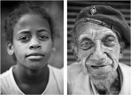
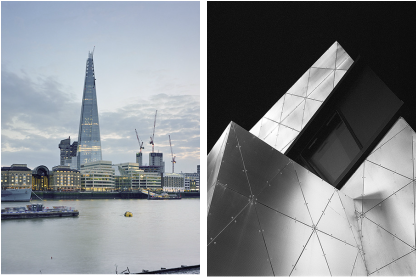
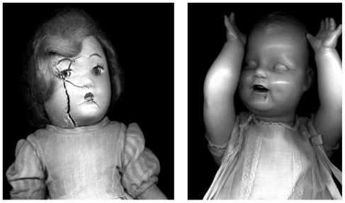
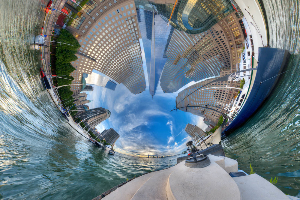
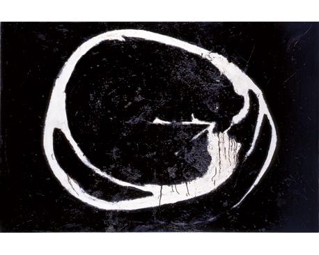
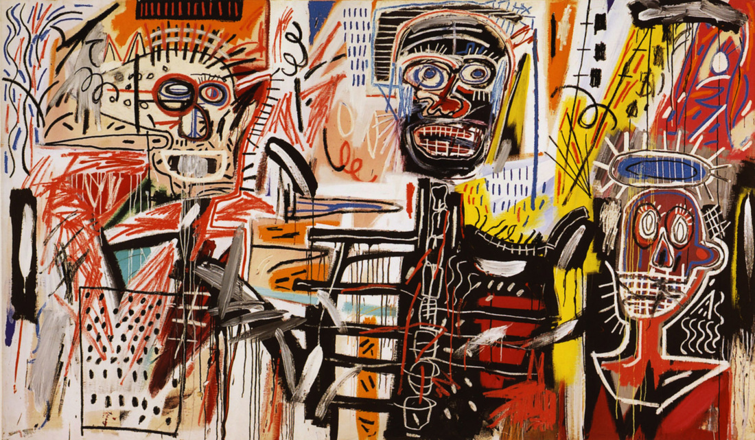
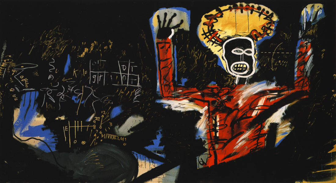
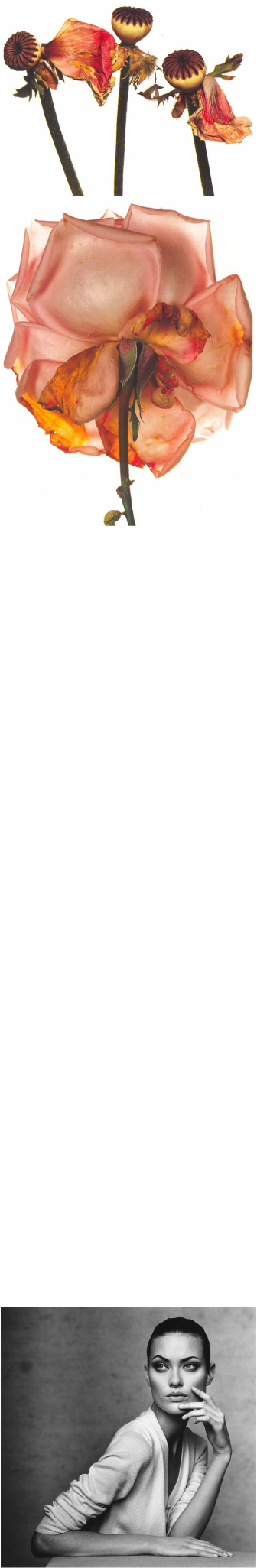
FILIP MEUTERMANS IS AN INDEPENDANT PHOTOGRAPHER FROM EUROPE. HIS WORK FOCUSES PRIMARILY ON THE CONTRAST BETWEEN THE YOUNG AND OLD. THE MAJORITY OF HIS WORK ARE CONFLICTING CONTRASTS BETWEEN COLOUR PHOTOGRAPHY AND BLACK AND WHITE PHOTOGRAPHY. PERSONALLY I PREFER HIS WORK WHICH EXPLORES BLACK AND WHITE PHOTOGRAPHY AS IT EMPHASISES TEXTURES AND CONTRASTS MORE; ESPECIALLY IN HIS PHOTOGRAPHS WHICH FOCUS ON AGE. THE JUXTAPOSITION'S CREATED ARE TRUELY PHENOMENAL. HIS USE OF A GREYSCALE FILTER REALLY EMPHASISES THE WRINKLES AND DECAY ON THE AGED. HIS USE OF BLACK AND WHITE ON THE YOUNG EMPHASISES THE CLARITY AND CLEARNESS OF THEIR YOUNG AND YOUTHFUL SKIN. THE CONTRASTS BETWEEN THE TWO ARE VERY EVIDENT. I REALLY LIKE HOW HIS USE OF B&W FILTER HIGHLIGHTS THE CLARITY OF THE SKIN WITHIN THE YOUNG. BARBARA KRUGER: BARBARA KRUGER IS AN AMERICAN CONCEPTUAL ARTIST BORN IN NEW JERSEY IN 1945. MUCH OF HER WORK CONSISTS OF BLACK AND WHITE PHOTOGRAPHS WHICH ARE OVERLAID WITH DECLARATIVE CAPTIONS OR QUOTES. THERE IS A CONSISTENT THEME OF POWER, IDENTITY, SEXUALITY AND POLITICS THROUGHOUT HER WORK. I REALLY LIKE HER STYLE OF WORK, I FIND IT INSPIRING HOW SHE TAKES IMAGES OUT OF THEIR ORIGINAL CONTEXT AND SETS THEM AS THE BACKGROUND AGAINST WHICH SHE EMBLAZONS CONFRONTATIONAL PHRASES. I REALLY LIKE HER USE OF CLEARLY LEGIBLE FONT AND CONTRASTING PALETTE OF RED AND BLACK. ANOTHER THING I ADMIRE ABOUT KRUGER'S WORK IS HOW SHE IS ADDRESSING THE AUDIENCE DIRECTLY WITH STRONG AND POWERFUL, MEANINGFUL MESSAGES. I THINK IT WORKS REALLY WELL. DANIEL HEWITT: DANIEL HEWITT IS AN INDEPENDANT PHOTOGRAPHER WHO'S WORK FOCUSES PRIMARILY ON BUILDINGS AND THE STRUCTURES OF THEM. HE ADDS EMPHASIS TO THE PERFECTION WITHIN THE ARCHITECUTURE OF THEM. FOR THIS VERY REASON I BELIEVE THAT HIS PHOTOGRAPHS ARE A GREAT WAY OF REPRESENTING THE THEME OF PERFECTION RITA BERNSTEIN: Rita Bernstein is an alternative photographer. The photographs presented on this spread were taken in the early 1990’s and are part of her series entitled ‘past present’. within her work rita has explored the sorrows as well as the sweetness of family life and the general ambivalence that shadows intimate relationships. throughout her life, watching her own children grow up; she was reminded with the conflicts and restlessness that pervaded her own youth. her series of photographs which include dolls particularly interest me as they show the dolls in an unusual and unique way. they have been presented in a less traditional way and this is somthing i find admirable. generally dolls are supposed to be children’s toys therefore they are most likely to look happy and be associated with fun and upbeat things, whereas these dolls look more sinister and sad. the juxtapositions being produced are truly astonishing. what interests me most about the series is that the photographs have been altered to black and white. i think this definetly adds emphasis to the textures within the photograph.it also emphasis the sinister-ness and darkness of the photographs due to the dull and mundane colours. I really like the highlights which have been produced, you can see them very evidently.in my interpretation i intend on including a similaer take on her photographs accept i will make it alot less frightening. i intend on mimicing the sinister ambience though as i think it works well. Her photographs represent the theme of flaws and perfection because they are in complete contrast with their original stereotype. overall i find her work very unique and interesting. JOHN STEZAKER: John Stezaker (1949) is an english conceptual artist. his work is surreal in tone and is often made using collage and postage prints. i really like his work in my opinion as its abstract. i really like the way that he creates contrast by placing coloured prints over the top of greyscale photographic backgrounds. stezaker uses classic movie stills, vintage postcards and book illustrations to make collaged compositions to give the original image a new meaning. he adjusts photographs exploring with inverting and slicing seperate parts of them and pieceing them together to create a unique new work of art. he explores the subversive force of found images. Stezaker’s famous mask series is a series consisting of obscure and distorted photographs of the profiles of glamourous sitters with caves or even waterfalls for making images of eerie beauty. RANDY SCOTT SLAVIN: Randy Scott Slavin is an award-winning director and surrealist photographer based in new york city. he creates a series of 360 degree panoramic landscape photographs. he creates spherical panoramic photographs of various landscapes and cityscapes. he makes the surreal images by shooting hundreds of photographs of a scene and then stiches them together into a sterographic projection. he calls the work ‘alternate perspectives’. Overall i find his work truely inspiring. i think it is very clever how he distorts standard photographs and turns them into a flawed perfection. i really like how his photographs represent the theme of flaws and perfection. In my interpretation i intend on creating his technique within photoshop, using the polar cooridinate’s tool which is under distort in filters as this will create a similar effect. i also intend on editing my manipulated photograph in camera raw, where i will enhance the vibrance of my photographs, similar to the work of the artist. i think this will really enhance the representation of my interpretation. JIRO YOSHIHARA: Jiro yoshihara (born 1905)is a japanese painter. yoshihara didn’t recieve any formal art education throughout his entire life. however in the early twenties he joined the nika-kai who are a group of painters. during the 1920’s and 30’s yoshihara said his work was influenced heavily by artists such as giorgio de chirico and wassily kandinsky. his work has been held in many diferent exhibitions over the years. Overall i find his work very abstract and unique. i also think his work is a good way of representing the theme of flaws and perfections as he is subtley creating flawed perfections with his artistic dripping shapes. Based on the work created by him which i have researched i have decided to create my own interpretation. i intend on using ink instead of paint as i think this will drip and run more efficiently. My aim is to interpret his work to be most accurate. JEAN MICHAEL BASQUAIT: Jean - Michael Basquiat(1960-1988) was an american artist, musician and producer. his work follows the neo-expressionist and primitivist movement. basquait’s art focused on "suffestive dichotomies" such as wealth vs. povetry, integration vs. segregation and inner vs. outer experience.his work consitsts of poetry, drawing, painting, married text and image, abstraction, figuration and finally historical information mixed with contemporary critique. basquiat’s key technique within his work was to use social commentary as a "spring board to deeper truths about the individual". he also found attacks on power structures and systems of racism a comportable theme to explore within his work. i find his poetics acutely political and direct in their criticism of colonialism and support for class struggle. Fred hoffman hypothesizes that underlying basquiat’s sense of himself as an artist was his "innate capacity to function as something like an oracle, distilling his perceptions of the outside world down to their essence and, in turn, projecting them outward through his creative acts." I particularly like baisquait’s style of work due to the raw, racial and poetic sloppy-ness it is. his final composition isn’t a pretty picture, nor a balanced composition - he presents the audience with an almost reversible set of emotions. for that very reason i believe that his work is an ideal example of flaws and perfection. In the early 1980’s basquiat and the reknowned artist andy warhole created a series of collaborative paintings. like warhol, jean-michel basquiat constructed a persona that he presented to the public that was contradictory to who he truly was. i really like the series i find it very inspiring. IRVING PENN: Irving Penn (born 1917) is an american photographer who is most known for his fashion photography and still life photographs. penn’s career included work at vogue magazine and independent advertising work for clients. his work has been exhibited internationally and continues to inform the art of photography. i particularly like his still life photographs of rotting and decaying fruit. i think this is a really nice way of representing the theme of flaws. i also find his still life photographs of dead flowers admirable. they are the perfect representation of flawed perfections. His photographs of various models, including lisa fovergroves is the perfect representation of perfection. overall i think his work represents the theme well, including contrasts ascorss the broad theme. . |


|
